Google is always emphasizing in all of its update announcements how important it is to provide a top-notch user experience for your website visitors.
By capitalizing on several of the following Ranking Factors Google has like:
- Pagespeed – how fast does your site load? (especially on mobile)
- Dwell time – how long do your visitors stay on your site?
- Bounce rate – how many visitors leave your site right away?
- Click-through rate – how many searchers actually link on your listing to go to your site?
- Responsiveness – is it designed for all device types and sizes, including desktops, tablets, and smartphones
we can easily determine whether your visitor is having a great user experience or not.
You have just about 2 seconds to capture the attention of a first-time visitor and in those 2 seconds, you have to tell them who you are, what you’re offering, and how it can benefit them.
Does your site do this for your users?
Because if it doesn’t, then you lose them to the dreaded back button and Google notices that your site didn’t give them what they wanted so they went elsewhere.
But why did they bounce? What was it on your site that was, or wasn’t there that made them leave so fast?
This is where website usability comes into play.

Believe it or not, there are a lot of things that you can add, delete, or even relocate on the page to make your visitor have the best user experience UX that makes them want to stay longer on your page and even convert into a lead.
I will say that the BEST thing you could do for your site and the goals that you want to reach is to have usability testing performed on your site or on a page that you want to convert visitors into leads.
When I was getting my Bachelor of Science Degree in Internet Marketing my all-time favorite class was Website Usability. When I first entered that class I sort of had an idea of what it would be about since I had been working online since 1999, but boy oh boy did I learn some valuable site usability lessons.
Not to mention the usability testing that we got to perform in the classroom on websites that were looking for feedback on their websites.
In every class, we were given a book to follow along with and in this class, we were using the book by Steve Krug, ‘Don’t Make Me Think: A Common Sense Approach to Web Usability, 2nd Edition’.
What is website usability and why is it so important?
Website Usability is giving your visitor the means to move around your site seamlessly, and be able to find what it is they are looking for easily on multiple devices, without making them think too much.
Simply put, is your website user-friendly? Does it focus on your visitor’s experience or on what you want or feel like having on your site?
You only have those 3 seconds for a visitor to figure out if they want to stay on your site or bounce so you have to make the most of it.
You’ll never get a second chance to make a great first impression.
As a matter of fact, when it comes to your website, 88% of online consumers are less likely to return to a site after a bad experience (Justin Mifsud, founder, Usability Geek) YIKES!
Have you ever been on a site that made you jump through hoops just to get their contact information? Or what about a site that has a million and one ads on it and you click on a link to go to another article but accidentally click on one of those ads?
What did YOU do in this situation?
Me…I bounced right off that site and looked for another website that could help me without all the frustration I had just experienced.
What makes a user have a horrible experience on your Website
Now that you know what website usability is, how it affects your user’s experience and WHY it’s sooo important, let’s go over the elements on a site that can boost your users experience.

I do want to preface this part by saying I’m in no way trying to make fun of or call out a website just to do it. My entire purpose is to show you what to avoid when it comes to your visitor viewing your site and how to make it an enjoyable experience.
If by some small chance you are the owner of one of the sites I share below…reach out to us so that we can help get your site to work for your business and not make visitors jump to a competitor’s site.
Let’s get started!
I want you to put on your visitor glasses and look at these websites through your own eyes. I’ll point out some things that make me want to leave the site and you can let me know in the comments section below what rubbed you wrong and made you want to bounce too.
which three increase the usability of a website for Conversions
1. Load Speed
I’d have to say that time and time again the load speed is the number one factor of whether your page will rank (it’s one of Google ranking factors and rightfully so) and if the visitor will stay long enough for it to load.
If your visitor decides not to stay and clicks on that back button to go back and choose another site, that is considered a “bounce” in your analytics and lets Google know that your page didn’t give the visitor what they were looking for.
There goes a negative mark against you in Google!
Of course, nowadays you need to make sure that your site not only loads fast on a desktop but also on mobile.
One of the biggest culprits when it comes to page speed is images. We see it all the time with our clients websites. Images are not optimized and uploaded just as they are, which is almost always a large file size that takes forever to load.
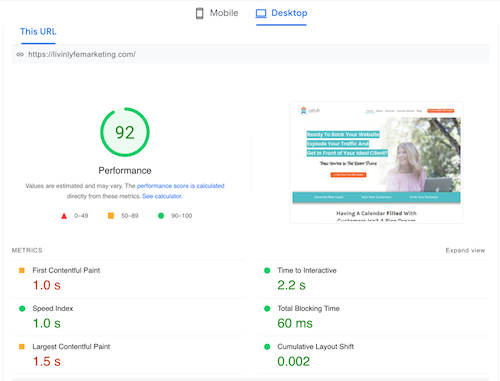
To check your page speed go here >>> https://pagespeed.web.dev/ type in your url and Google will let you know your page speed on both desktop and mobile.
If you need help getting your page up to speed on desktop or mobile, our team will do that for you. Just give us a call or contact us
2. Responsiveness (Mobile/Tablet Friendly)
In the world of web design, responsiveness simply means does it look good and function well on ALL technology like your tablets and phones/mobile?
According to Statista , “in 2021, the number of unique mobile internet users stood at 4.32 billion, indicating that over 90 percent of the global internet population use a mobile device to go online.”
Internet traffic from mobile accounts for almost 55% of the total web traffic.
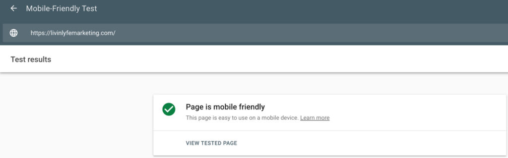
Check to see if your site is responsive and mobile-friendly here.
People are using their mobile devices more and more and it’s only going to go up from there.
You want to make sure that your website keeps the same look and feel that it has on desktop but is designed for tablets and mobile as well.
Can your visitor easily contact you if they need to? Is your phone number or CTA prominent on the page? Can they easily navigate your menu and find the services they are looking for?
If not, you’ll want to ask maybe friends and family to view your site on their devices and give you some feedback on how you can make it better.
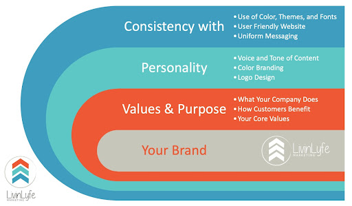
3. Website Branding
When branding your website there is one main goal and that is to convey your message through your branding. There is so much to branding but the three main parts are:
Values & Purpose – What does your business offer, how do your customers benefit, and your logo should depict this
Personality – Voice, tone, and content along with the color and logo design should all be cohesive
Consistency – On all online platforms you want the same color, themes, fonts, and messaging to be the same.
Below is an image of the primary areas that need to be accomplished. Just remember that CONSISTENCY is KEY when it comes to branding online and how you optimize your site and Social Media!
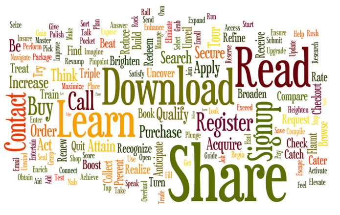
5. To many CTA (Call to Actions)
Call Me! Fill Out This Form! Download This Free Guide! Schedule a Discovery Call! Join My Group! Work With Me!
Just look at the word cloud for all the different CTA’s a page can have and you too will quickly get overwhelmed.
Think about your main goal for each page you are ranking for. For a local business, many clients want the customer to give them a call or fill out a form to receive a callback. If this is you then you’ll want to make sure your phone # is easy to find with a CTA of Call Now for Free Quote!
If you are an online service-based business like a coach or virtual assistant, your one goal may be to get your potential client to schedule a call with you or build your email list. Let’s say you’re giving away valuable content so your CTA would be
Whatever that goes is, make it that ONE goal and focus on showcasing that CTA throughout the page. On the page, you are trying to rank, and your website overall should have clear, single-focused, CTA’s at least above the fold (the top part of the website the visitor sees first)!
It’s one singular focus, either yo
6. 404 Page not found – The Dreaded 404 Error.
Not only can this error message doom your chance of ever getting that visitor back, but it’s also one of the many ranking factors when ranking on Google.
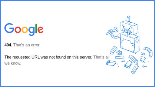
Let’s face it…if you were to land on a page like this while researching or looking to buy something what are you going to do?
Click or tap on that back arrow right?
The top 5 reasons your site is giving a visitor a 404 error message are: